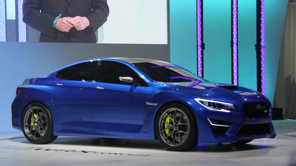
For as long as it’s been around, the Subaru WRX hasn’t really been about aesthetics. It’s the kind of car where once you get behind the wheel and start driving, the way it looks on the outside becomes irrelevant. That’s good because most WRX-es have ended up looking like Corollas with hood scoops and absurd wings. The Subaru WRX Concept aims to change all that.
I know this because I used to own a WRX. Mine was a 2008 model, an especially boring body style that stuck around for a couple years before Subaru plastered on ridiculous fender flaresthat made it look more bulbous than aggressive.
Honestly, this isn’t even a WRX problem. It’s a Subaru problem. They make remarkably tough, capable, fun cars, but they’re seldom attractive. About the only good-looking Subie in recent years was the fourth-generation Legacy. The rest of them are kind of miserable-looking. Even the BRZ isn’t what I would call an elegant sports car design.
But that changed today at the New York Auto Show. If the cues from the Subaru WRX Concept carry over to the production version, we finally have a WRX that looks as great as it will probably drive.
I think it beats the outgoing car in many ways. First of all, it looks like it was designed from the ground up to be a fierce rally car, not just an Impreza with a bodykit. (That’s probably because it was — rumor has it the next WRX will become its own animal, separate from the Impreza line). It bears a strong resemblance to the 2011 Advanced Tourer Concept, particularly from the front. The roofline is much lower than the old car, giving it an almost coupe-like stance. I really like the pinched C-pillar.
This isn’t a very scientific assessment, but size wise, I think it’s at least as long as the outgoing car, maybe a bit longer. It is also noticeably wider and lower. The lines of the car are much more flowing in person than they seemed in the shots we had earlier this week.
You’ve got your fender flares, but they’re more artfully done here than any previous ‘Rex. The front ones are not unlike the fenders on the 2013 WRX, and they have the same side-mounted turn indicator.
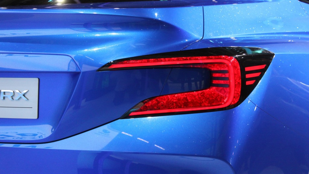
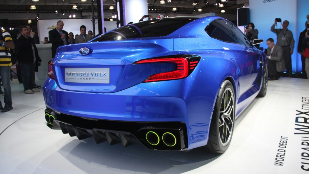
In some ways, it reminds of the Evo X, especially with the splitters on the rear bumper. I love the prominent quad exhaust, mounted closer to the sides than the current car. The trunk is a little busy (ace spy photographer Brian Williams says it looks like the current Camry’s trunk, and now I can’t un-see that) but I do like it. Notice the lack of a spoiler of any sort, whether it be the more conservative one from the WRX or a big STI-style rear wing.
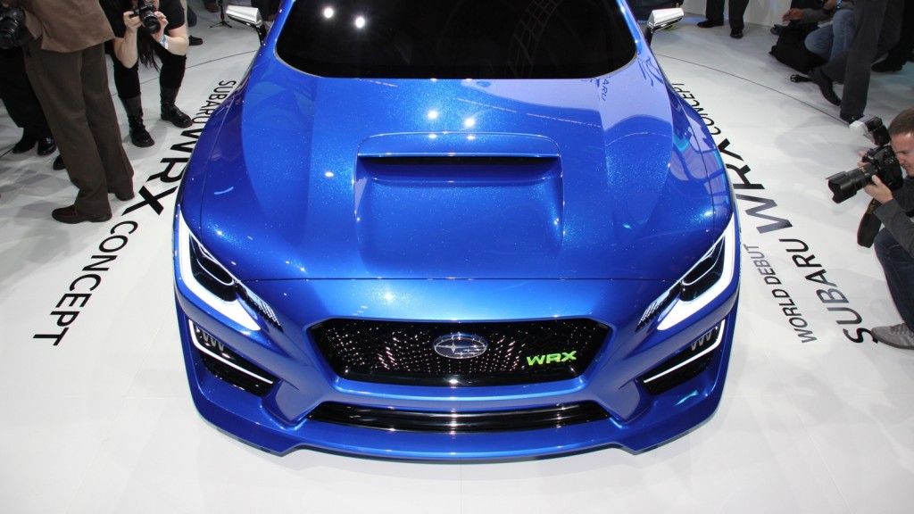
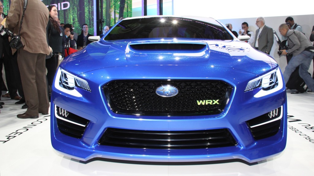
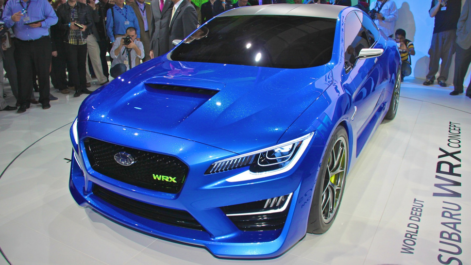
And then we come around to the front end. The hexagonal grille is reminiscent of what we’ve seen on the BRZ and other modern Subarus, but the overall shape isn’t too distinctive. What I really like is that hood scoop. It finally looks like it was meant to be there, integrated nicely into the hood, not tacked on as an afterthought. I also like the scallops in the hood beside the scoop.
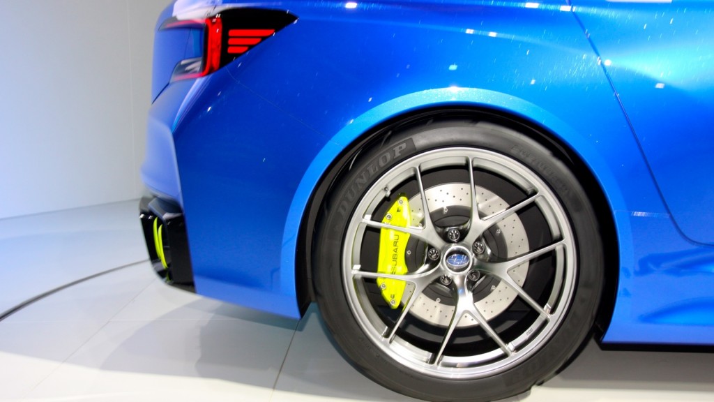
Those big vents on the front bumper remind me of the BMW 1M Coupe, and that’s not a bad thing at all. One other thing I like from the concept: the neon green accents throughout, including on the brake calipers, the WRX badge, and the exhaust tips. It’s a nice touch and it complements the world rally blue color quite well and in an unexpected way.
